By PDS Team
Google now crawls and indexes websites using its smartphone crawler, so your mobile site is effectively your website as far as Google Search is concerned. Google said that from 5 July 2024 it would crawl and index all sites with Googlebot Smartphone, and that pages which do not work on mobile devices may no longer be indexed. This mobile SEO checklist covers what to check so your mobile pages are complete, fast and easy to use.
What does mobile-first indexing mean?
Mobile-first indexing means Google uses the mobile version of your pages for crawling, indexing and ranking.
Google started moving sites to mobile-first indexing in 2016 and announced in its June 2024 Search Central blog post that the switch was essentially complete. From 5 July 2024, the remaining sites are crawled with Googlebot Smartphone too. Google noted that a small number of sites that do not work on mobile at all would no longer be indexable. If something is missing on your mobile pages, Google may not see it, even if it appears on desktop.
1. Does your mobile site show the same content as desktop?
Your mobile pages should have the same important text, images, links and structured data as your desktop pages.
- Do not hide or remove important content on mobile to “save space”. Use tabs, accordions or expandable sections instead.
- Keep the same headings, product details, reviews and FAQs on mobile.
- Make sure internal links in desktop menus are also reachable on mobile.
- Include the same structured data and meta tags (title, description, robots) on mobile.
- If you use separate mobile URLs (m-dot), check they are correctly linked. Google recommends responsive design as the easiest pattern to maintain.
2. Can Googlebot Smartphone access your resources?
Google needs to load your CSS, JavaScript and images to render the mobile page, so do not block them.
- Check robots.txt does not block folders containing CSS, JavaScript or images.
- Use the URL Inspection tool in Search Console to see how Google renders a page.
- Avoid lazy-loading primary content in ways that require a user action, such as tapping or scrolling, before it loads.
- Make sure your server can handle crawling of the mobile site, especially for large sites.
3. Is your site easy to use on a phone?
Text should be readable, buttons easy to tap and the layout fit the screen without zooming or sideways scrolling.
| Check | What good looks like |
|---|---|
| Viewport | A meta viewport tag so the page scales to the device width |
| Text size | Readable body text without zooming |
| Tap targets | Buttons and links large enough and spaced apart |
| Layout | No horizontal scrolling or content wider than the screen |
| Pop-ups | No large pop-ups covering content as soon as the page opens |
| Contact | Click-to-call, WhatsApp and directions easy to find |
Google retired its Mobile-Friendly Test tool and the Mobile Usability report in Search Console in December 2023. Use Lighthouse in Chrome DevTools and test on real phones instead. Our website design services design and test layouts for phones first.
4. Is your mobile site fast enough?
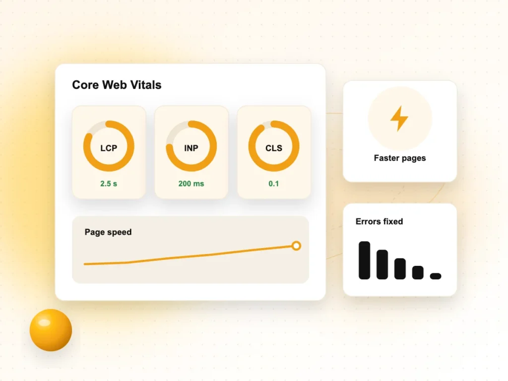
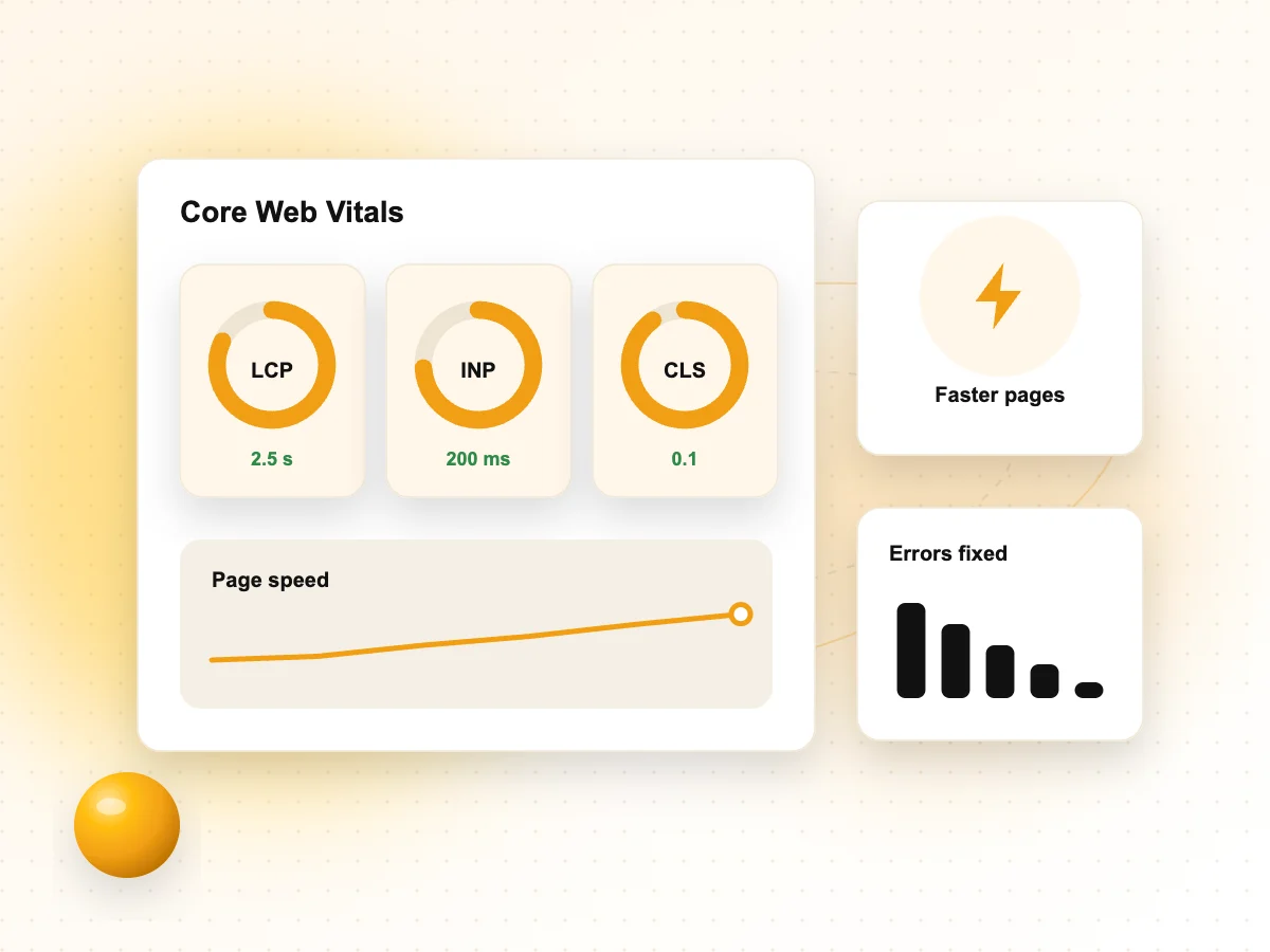
Check Core Web Vitals for mobile and fix slow loading, poor responsiveness and layout shifts.
- Largest Contentful Paint (LCP): aim for 2.5 seconds or less.
- Interaction to Next Paint (INP): aim for 200 milliseconds or less. INP replaced First Input Delay as a Core Web Vital on 12 March 2024; our INP guide explains how to improve it.
- Cumulative Layout Shift (CLS): aim for 0.1 or less.
Images are often the biggest problem on mobile. Our image SEO guide covers sizing, compression and lazy loading. Remember many Indian users browse on mid-range phones and variable mobile data, so test on a real device, not only on a fast office connection.
5. Are your mobile pages set up correctly for search?
Check that mobile pages have the right titles, meta descriptions, canonical tags and indexing settings.
- Use the same robots meta tags on mobile and desktop; a noindex on mobile can remove pages from Google.
- Check canonical tags point to the right URLs.
- Keep titles and meta descriptions on mobile pages, not just desktop.
- Check the Page indexing report in Search Console for errors after design changes.
6. What about local and conversion features on mobile?
Make it easy for mobile visitors to contact or visit you, because mobile searches often lead to immediate action.
- Put your phone number and a click-to-call button near the top of key pages.
- Add a WhatsApp chat link if customers prefer messaging.
- Show your address with a link to Google Maps directions.
- Keep forms short, with the right keyboard for each field (number pad for phone numbers).
- Keep your Google Business Profile accurate, as it often appears before your website on mobile.
Mobile SEO checklist summary
Run through these checks after any redesign and at least every few months.
- Same important content, links and structured data on mobile and desktop.
- CSS, JavaScript and images not blocked; pages render correctly in URL Inspection.
- Readable text, large tap targets, no horizontal scrolling.
- No intrusive pop-ups on mobile.
- Good Core Web Vitals for mobile in Search Console.
- Correct titles, robots tags and canonicals on mobile pages.
- Easy calls, WhatsApp, directions and forms.
For a full mobile audit and fixes, see our technical SEO services.
Mobile SEO FAQs
Has Google completed mobile-first indexing?
Yes, essentially. Google announced in June 2024 that it would crawl and index all sites with Googlebot Smartphone from 5 July 2024, completing a move that began in 2016. Sites that do not work on mobile devices at all may no longer be indexed. Your mobile site is what Google evaluates.
Where did the Mobile-Friendly Test go?
Google retired the Mobile-Friendly Test tool, the Mobile-Friendly Test API and the Mobile Usability report in Search Console in December 2023. You can use Lighthouse in Chrome DevTools to check mobile usability and performance, and URL Inspection in Search Console to see how Googlebot renders your pages.
Is responsive design better for SEO than a separate mobile site?
Google supports responsive design, dynamic serving and separate mobile URLs, but recommends responsive design because it is the easiest to implement and maintain. One URL and one set of HTML for all devices avoids problems with missing content, wrong redirects or mismatched tags between mobile and desktop versions.
Does hidden content on mobile still count?
Content inside tabs, accordions or “read more” sections on mobile can still be indexed if it is in the page’s HTML when it loads. Content that only loads after a user taps or scrolls may not be seen by Google. Keep important content in the page source.
Do I need a separate mobile app for SEO?
No. Google Search indexes websites, so a fast, mobile-friendly website is what matters for search visibility. An app can be useful for regular customers, but it does not replace a good mobile site. Many businesses start with an excellent mobile website before considering an app.
How do I check my site's mobile speed?
Use PageSpeed Insights to see field data for real mobile users and lab results, and check the Core Web Vitals report in Search Console for groups of pages. Then test key pages on a real mid-range phone using mobile data, since that reflects many customers’ experience.
Want your site ready for mobile-first Google?
We audit and fix mobile SEO for websites across Noida, Delhi NCR and India. See our technical SEO services or contact our team.